p
r
o
j
e
c
t
s
BRIEF
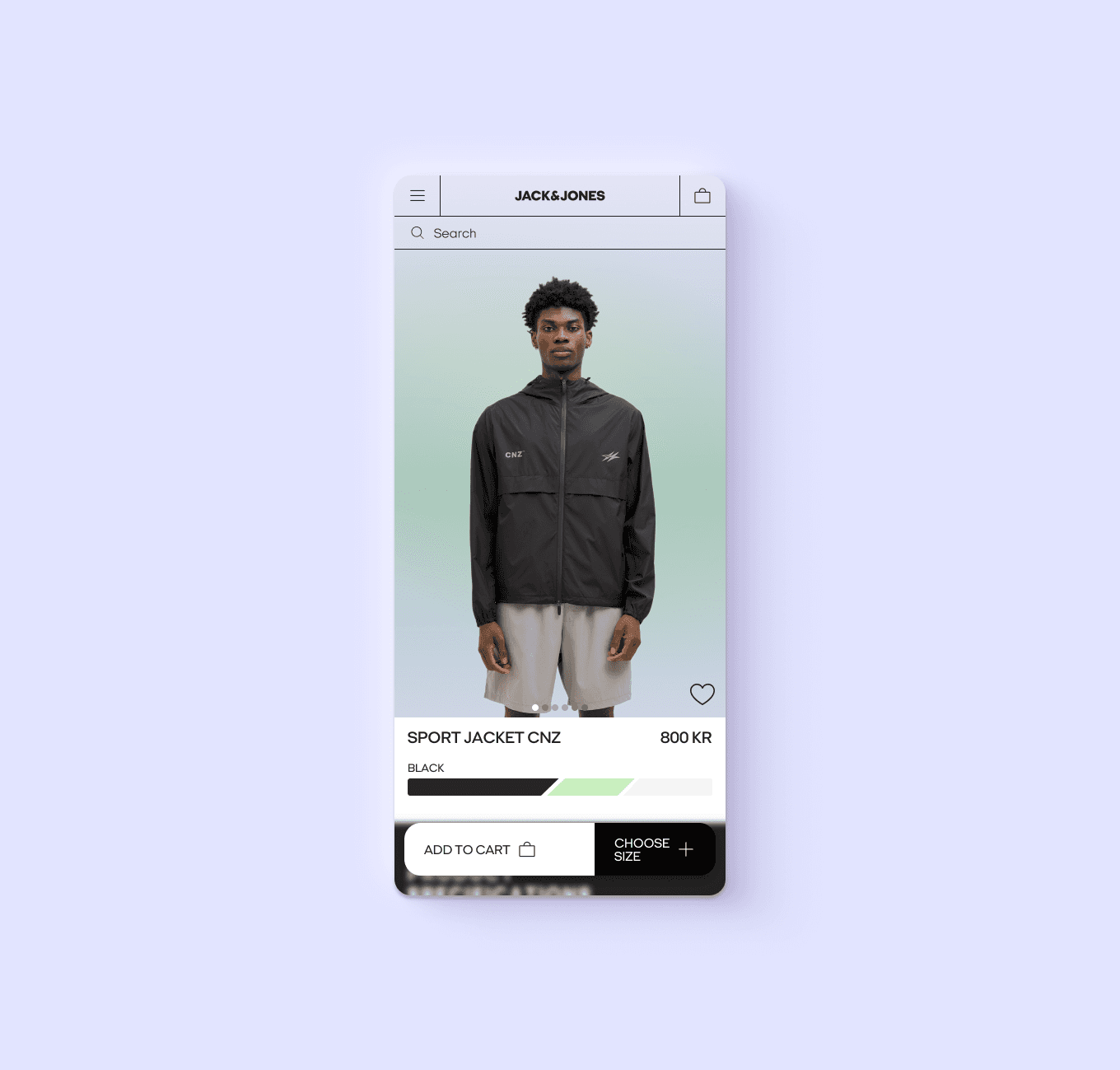
This school project was carried out in collaboration with the design agency Grebban. The assignment was to redesign a product page for Jack & Jones, focusing on enhancing the visual expression and user experience.
After the project ended, my teammate and I decided to revisit the concept independently, this time aiming for a sportier and edgier look.
SOLUTION
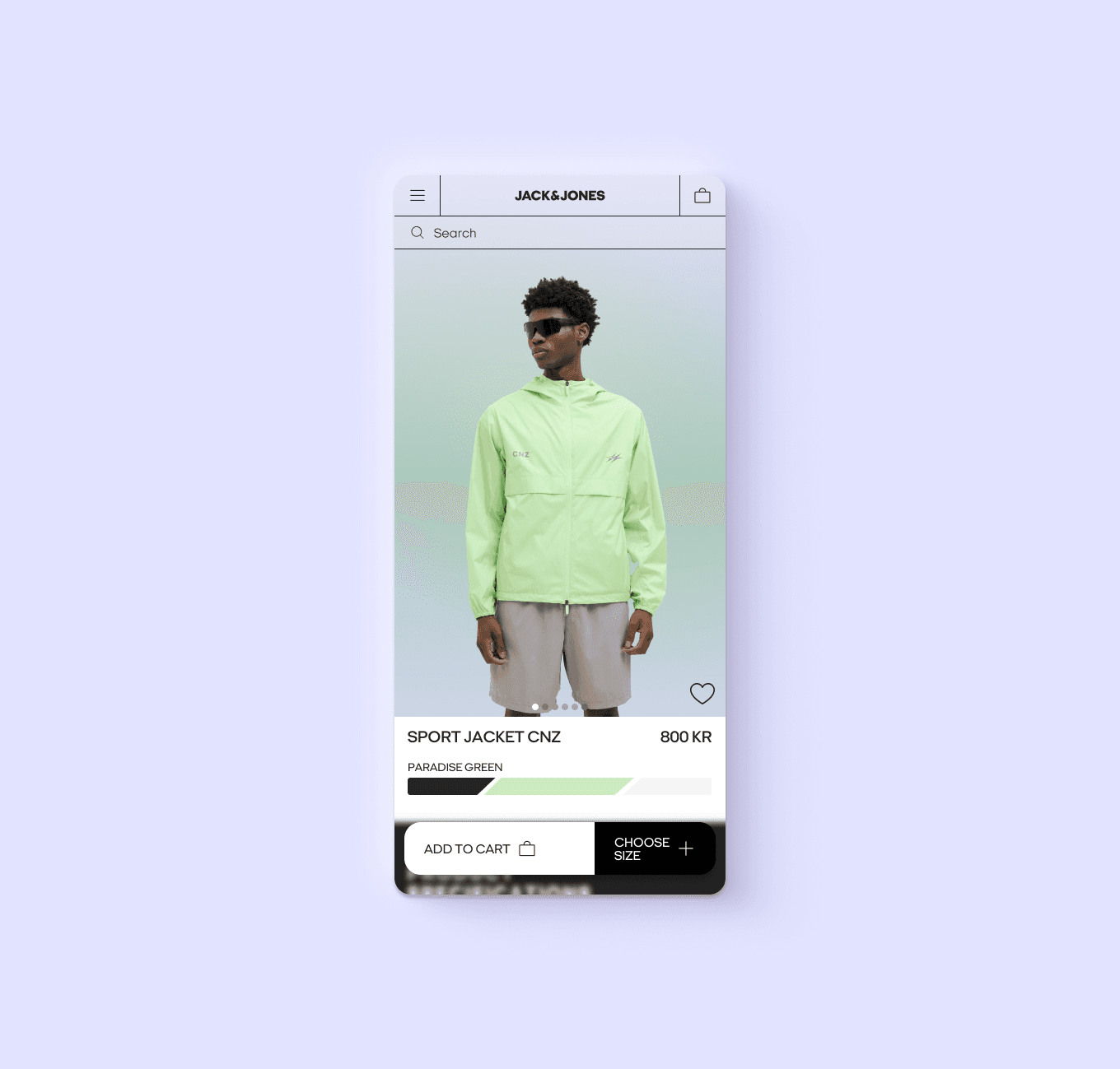
To align the redesign with a sportier and more dynamic aesthetic, we introduced a bold visual language rooted in movement and energy.
We expanded the existing monochrome palette with vibrant accent colors, creating contrast and a more contemporary, expressive feel. The addition of geometric shapes and angular elements reinforced the edgy direction, while still maintaining clarity and hierarchy.
Call-to-actions were redesigned for greater visibility and impact, and the overall layout was streamlined to support a more focused and intuitive shopping experience.
PROCESS
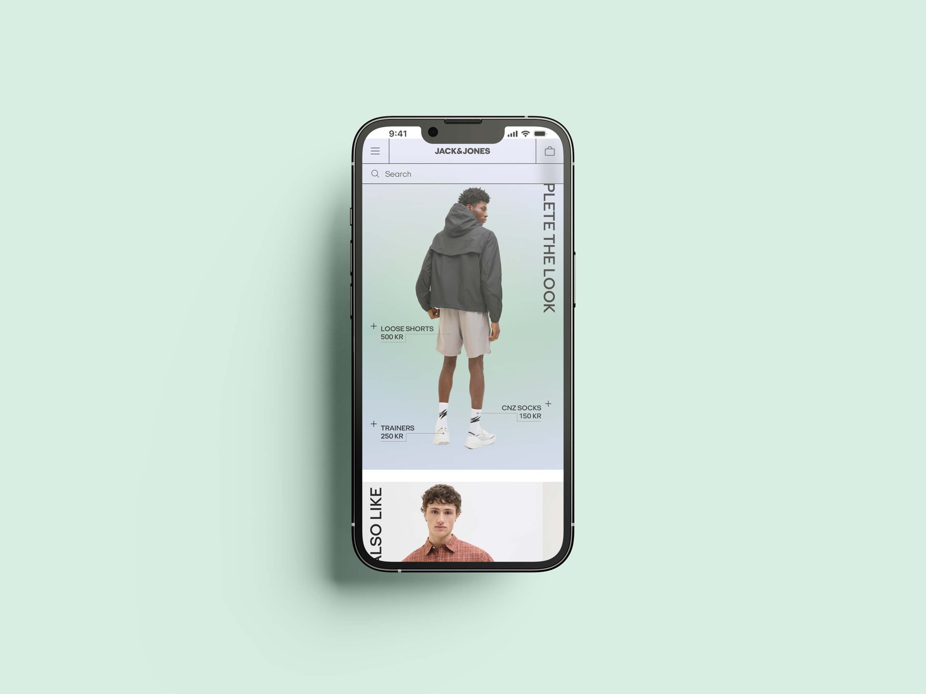
We started by analyzing the existing product page, with the requirement to keep all original elements intact. The main goal was to modernize the visual identity without compromising functionality.
Through research and visual exploration, we experimented with color, form, and layout. After completing the initial version, we chose to develop a second iteration on our own, exploring a more experimental direction inspired by sportswear, movement, and bold aesthetics.
p
p
r
r
o
o
j
j
e
e
c
c
t
t
s
s